
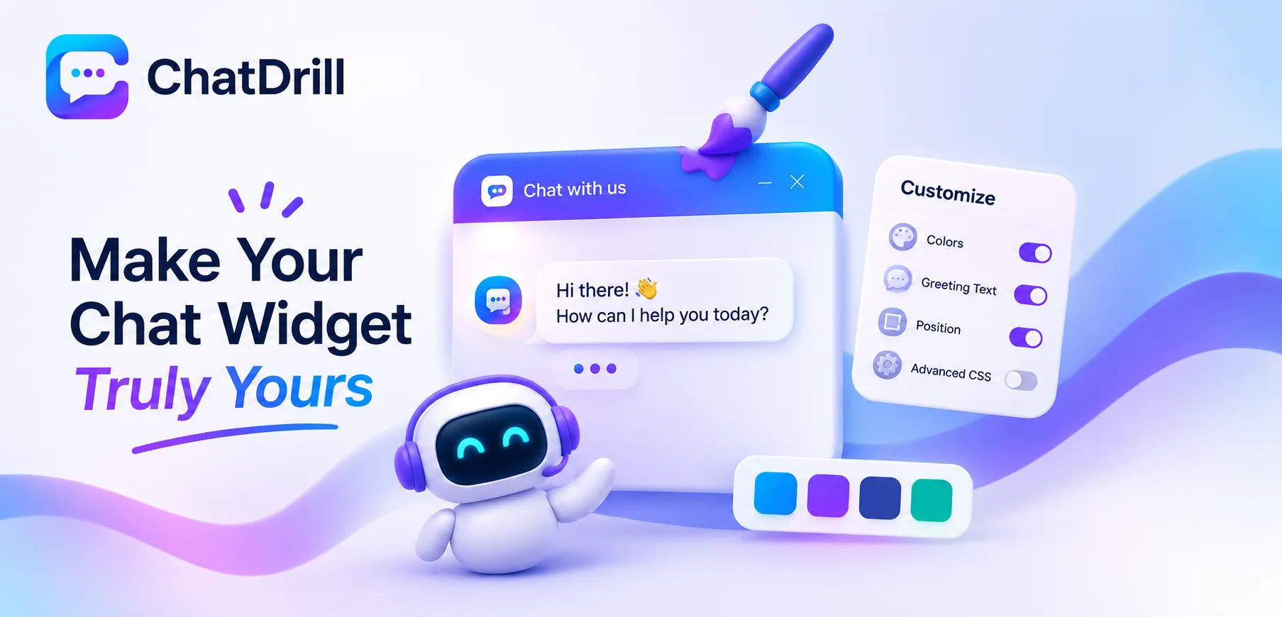
A chat widget that visually matches a brand, correct colors, matching tone in the greeting message, consistent iconography, feels like a natural part of the site rather than a bolted-on third-party tool, and that difference genuinely affects how much visitors trust and engage with it.
This isn't just an aesthetic nicety, a widget that looks and sounds off-brand can subtly undermine the credibility a business has otherwise worked to build across the rest of its site, particularly for visitors encountering the brand for the first time.
The good news is most of this customization requires no code at all, modern chat platforms including ChatDrill expose color, positioning, greeting text, and icon settings directly through the dashboard, with custom CSS reserved only for the more advanced, specific customization needs.
Getting branding right also isn't a one-time task, it's worth revisiting as a brand evolves, and worth keeping consistent across every channel a chat platform covers, not just the primary website widget.
This guide covers why widget branding matters, what's customizable out of the box, a step-by-step walkthrough of the core customization options, matching greeting messages to your brand's tone of voice, advanced customization with custom CSS, keeping branding consistent across channels, and common mistakes to avoid.
Why Widget Branding Matters
Widget branding matters because a chat experience that visually and tonally matches the rest of a site builds trust and feels like a natural extension of the brand, while a generic, unbranded widget can subtly signal a less polished, less trustworthy business.
The trust signal a well-branded widget sends
A widget matching a site's color palette and voice signals attention to detail, the same kind of polish visitors already associate with the rest of a well-designed site.
This matters particularly for a visitor's first interaction with a brand, where small consistency cues meaningfully shape an initial impression of professionalism and trustworthiness.
What happens when branding is neglected
A default, unbranded widget, mismatched colors, generic greeting text, can feel jarringly out of place on an otherwise carefully designed site, undercutting the polish built elsewhere.
This mismatch is rarely dramatic enough to consciously register with most visitors, but it can quietly contribute to a sense that something about the experience feels slightly off.
Why this is a worthwhile investment despite being quick to fix
Most of the meaningful branding customization takes well under an hour to configure, making it one of the higher-return, lower-effort improvements available to a chat setup.
Given how little time this takes relative to its impact on perceived professionalism, it's worth prioritizing early rather than leaving a widget at its default, generic settings indefinitely.
What You Can Customize Out of the Box
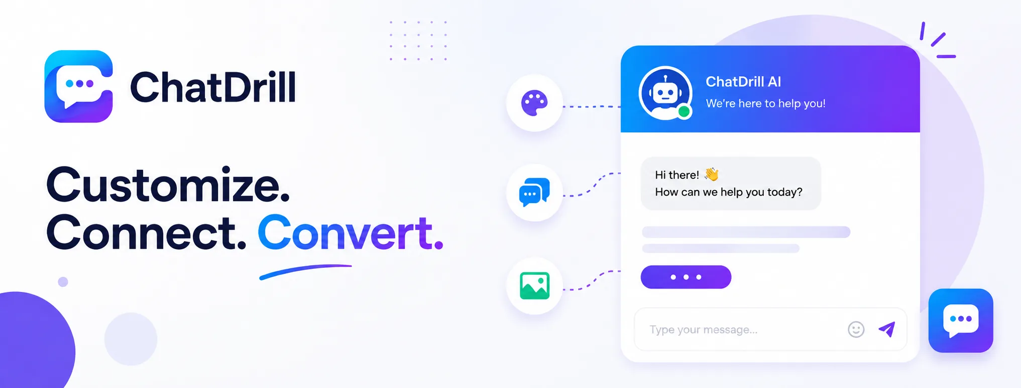
Most chat platforms, including ChatDrill, let you customize widget color, corner position, icon style, greeting message, and business name directly from the dashboard, without needing any code or developer involvement.
Color and visual styling
The widget's primary color, typically matching a brand's main accent color, along with secondary elements like button and text colors, are usually adjustable directly from settings.
Matching these to your brand's actual color values, rather than approximating from memory, ensures pixel-accurate consistency with the rest of your site's design.
Position and layout
Widget position, typically bottom-right or bottom-left, along with size and spacing from the edge of the screen, are configurable to fit a site's specific layout.
Testing the widget's position against any other fixed elements on the page, like a cookie banner or a floating call-to-action, avoids visual overlap that a default configuration might not anticipate.
Icon and avatar options
Many platforms let you upload a custom icon, often a brand logo mark, to replace the default chat bubble icon, further reinforcing brand identity at the point of first contact.
For a business using AI chatbot automation, a distinct avatar for the AI versus a human agent also helps set clearer visitor expectations about who or what they're talking to.
Business name and basic identity
Confirming the widget displays your actual business name, rather than a generic placeholder, is a small but easily overlooked detail worth double-checking during initial setup.
This detail matters more than it might seem, a visitor seeing an unfamiliar or incorrect business name in the widget header can create genuine confusion about who they're chatting with.
Step-by-Step: Customizing Colors, Position, and Icons
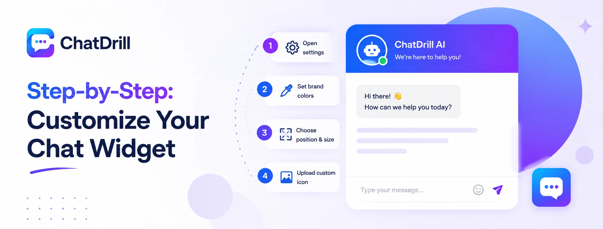 Customizing the core visual elements of a chat widget follows four steps: opening the widget customization settings, setting brand colors precisely, choosing position and size, and uploading a custom icon or avatar.
Step 1: Open widget customization settings
From your chat platform's dashboard, navigate to the Widget or Appearance settings section, which typically houses all visual customization options in one place.
This is usually a dedicated, clearly labeled section separate from more functional settings like automation rules or team management.
Step 2: Set brand colors using exact hex values
Enter your brand's exact hex color codes, pulled directly from your brand guidelines or design system, rather than approximating a similar-looking color by eye.
This precision matters more than it might initially seem, even a slightly off shade can create a subtle but noticeable inconsistency with the rest of a carefully designed site.
Step 3: Choose position and size settings
Select the widget's screen position and adjust size settings to fit comfortably within your site's existing layout, testing on both desktop and mobile views.
Previewing these changes on an actual live or staging page, rather than relying solely on a settings-panel preview, confirms the widget looks right in its real context.
Step 4: Upload a custom icon or avatar
Upload a brand mark or custom icon to replace the platform's default chat bubble, following any specific size or format requirements the platform's upload tool specifies.
Testing how this icon renders at actual display size, rather than just in the upload preview, confirms it remains legible and recognizable at the smaller size it'll actually appear.
Customizing Greeting Messages and Tone of Voice
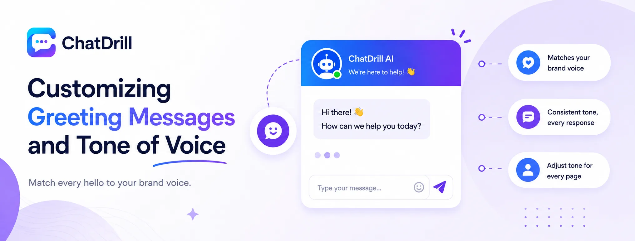
Beyond visual elements, the widget's greeting message and overall tone of voice, casual versus formal, playful versus professional, should match the same voice a brand already uses across its website and marketing.
Writing a greeting that matches your brand voice
A brand with a casual, friendly marketing voice should have a widget greeting that reflects that same energy, rather than a generic, corporate-sounding default message.
Reviewing how your brand writes elsewhere on the site, headlines, product descriptions, is a useful reference point for calibrating the widget's greeting tone appropriately.
Consistency between AI responses and brand voice
If AI chatbot automation is in use, its response tone should be trained to match the same brand voice as the initial greeting, rather than defaulting to a generic, neutral tone.
This consistency matters throughout the entire conversation, not just the opening greeting, since a mismatch partway through a conversation can feel jarring even if the initial greeting was well branded.
Adjusting tone for different pages or triggers
Some businesses vary greeting tone slightly by page, a more playful greeting on a product page versus a more direct, efficient one on a support-focused page.
This level of nuance is optional but worth considering for a brand with genuinely distinct tonal needs across different parts of its site.
Advanced Customization With Custom CSS
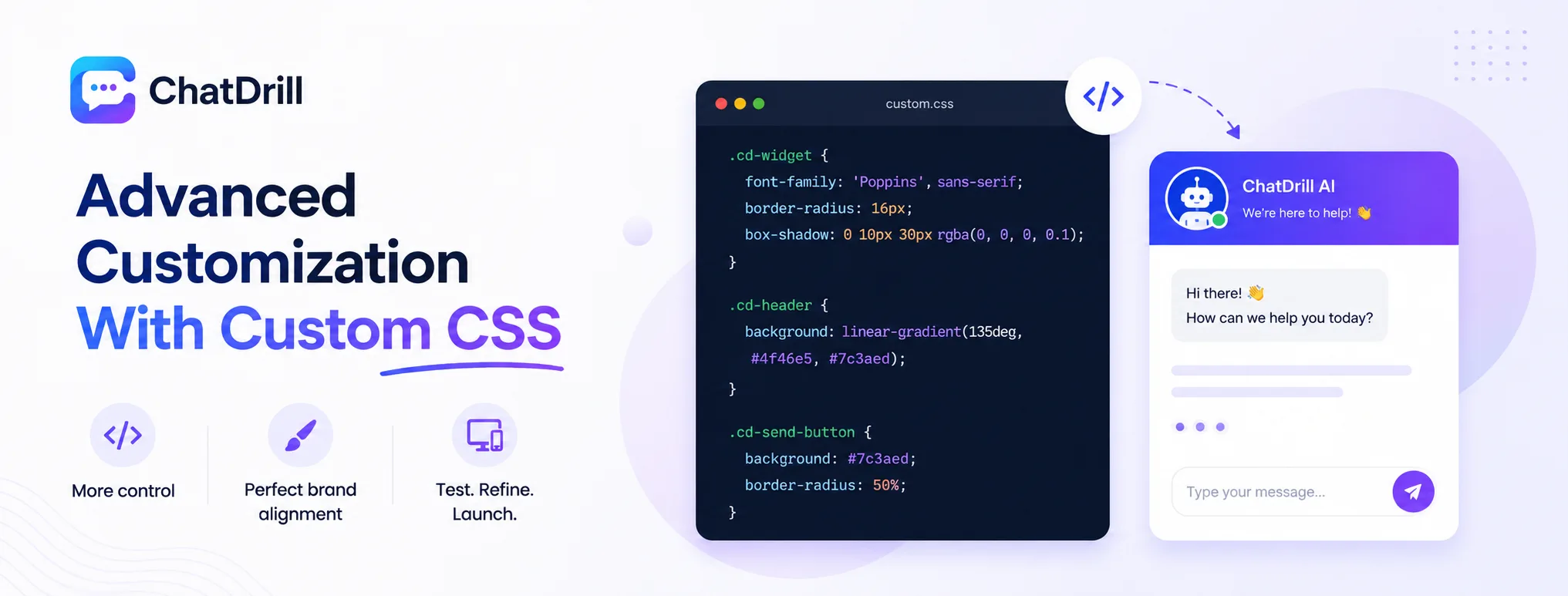
For customization needs beyond what a platform's dashboard settings support, most chat platforms allow custom CSS injection, giving finer control over widget styling at the cost of requiring some front-end development familiarity.
When custom CSS is actually necessary
Custom CSS is worth using specifically when a dashboard setting doesn't cover a genuine brand requirement, an unusual font, a very specific animation, rather than as a default approach to every customization.
Most branding needs are fully covered by standard dashboard settings, reserving custom CSS for the smaller set of genuinely advanced requirements keeps the setup more maintainable.
Common custom CSS use cases
Typical custom CSS use cases include matching a specific brand font not available in the platform's built-in font picker, or fine-tuning spacing and shadow effects to match a site's broader design system precisely.
Documenting any custom CSS applied, rather than leaving it undocumented, makes future updates or troubleshooting considerably easier for whoever maintains the site later.
Testing custom CSS changes safely
Testing custom CSS changes on a staging environment before applying them to a live site avoids an unexpected visual break affecting real visitors during the testing process.
Reviewing the widget across multiple browsers and device sizes after any custom CSS change confirms it renders correctly everywhere, not just in whatever environment it was originally tested in.
Branding Consistency Across Multiple Channels
For a business connecting WhatsApp, Messenger, or Instagram alongside a website widget, keeping branding consistent across every channel, not just the primary site, reinforces the same trust and recognition benefits everywhere a customer might engage.
Why cross-channel consistency matters
A customer engaging with a business across multiple channels, website chat one day, WhatsApp another, should encounter a consistently recognizable brand voice and identity in both places.
Inconsistency across channels can create a subtly fragmented brand impression, undermining the polish a well-branded website widget alone would otherwise create.
What's realistic to keep consistent across channels
Tone of voice and response style are generally fully controllable across every channel; visual branding is more constrained on channels like WhatsApp, which impose their own interface conventions.
Focusing consistency efforts on what's genuinely controllable, primarily tone and messaging, produces a more realistic and maintainable outcome than trying to force identical visual branding everywhere.
Common Branding Mistakes to Avoid
The most common widget branding mistakes are using an approximate rather than exact brand color, leaving the default generic greeting message unchanged, and letting AI responses drift from the brand's established tone of voice over time.
Using approximate colors instead of exact brand values
Eyeballing a similar color rather than using the exact hex value from brand guidelines creates a subtle but real inconsistency that's worth the small extra effort to avoid.
This is one of the easiest mistakes to fix, simply pulling the correct hex code from existing brand assets before configuring the widget.
Leaving the default greeting message unchanged
A generic, unedited default greeting is one of the most common and easily fixed branding oversights, worth checking specifically during initial setup rather than assuming it was already customized.
This is a five-minute fix with a disproportionately positive effect on how intentional and polished the overall chat experience feels.
Letting AI tone drift from brand voice over time
As an AI chatbot's knowledge base grows and evolves, periodically reviewing its actual responses against brand voice guidelines catches any gradual drift before it becomes a noticeable inconsistency.
This is worth building into a regular review cadence, rather than assuming initial tone training remains perfectly consistent indefinitely without any ongoing check.