
A weekly report that tries to cover everything in exhaustive detail tends to get skimmed at best and ignored at worst, while a focused, consistently structured report actually gets read and used to inform real decisions.
The goal of a weekly cadence specifically, distinct from a monthly or quarterly review, is catching emerging patterns and issues quickly enough to act on them, not producing a comprehensive historical record.
Getting the structure right means balancing enough detail to be genuinely useful against a length that respects how busy the people reading it typically are.
This guide provides a practical weekly reporting template, guidance on what to include and exclude, common mistakes, and how ChatDrill supports this reporting cadence.
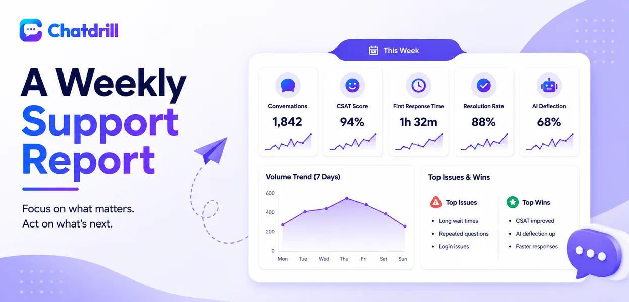
Quick answer: A weekly support report should cover volume trends, the core quality metrics (CSAT, first response time, resolution rate), AI deflection performance, and a short list of specific issues or wins worth flagging, kept to one page so it actually gets read rather than skimmed or ignored.
What Belongs in a Weekly Report
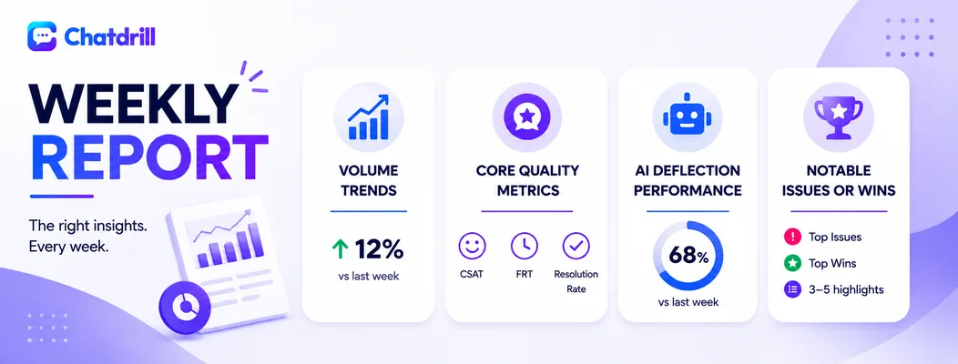
A strong weekly report covers volume trends, core quality metrics, AI deflection performance, and a short, specific list of notable issues or wins.
Volume trends
Total conversation volume compared to the prior week, plus any notable spikes or dips, gives immediate context for interpreting every other metric in the report.
This comparison should be brief, a simple week-over-week figure rather than an extended historical trend line that belongs in a less frequent, more comprehensive review instead.
Core quality metrics
CSAT, first response time, and resolution rate for the week, again compared to the prior week, form the essential quality snapshot most stakeholders actually care about.
Keeping this to these three or four core numbers, rather than an exhaustive metric dump, keeps the report genuinely scannable.
AI deflection performance
Deflection rate for the week, along with any notable change, tracks the ongoing efficiency contribution from AI-handled volume specifically.
This metric deserves its own line item given how directly it connects to both cost efficiency and overall team capacity.
Notable issues or wins
A short, specific list, three to five items, of anything genuinely worth flagging, a recurring complaint pattern, a particularly good save, an emerging training gap, adds the qualitative context raw numbers alone can't capture.
Keeping this list genuinely short and specific, rather than exhaustive, is what makes it actually get read rather than skipped over.
Keeping the Report to One Page
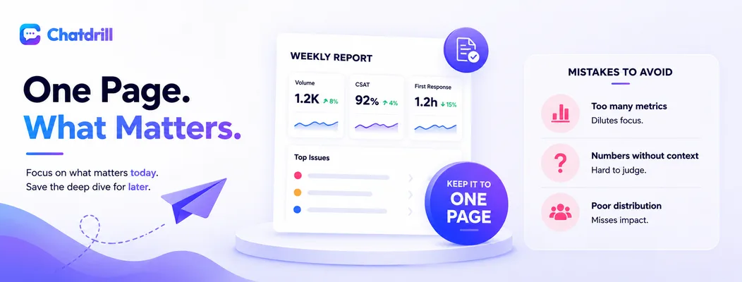
Constraining the report to a single page forces genuine prioritization of what matters most, producing a document people actually read rather than skim past.
The discipline of a length constraint
Committing to a one-page format forces a genuine choice about what's actually worth including each week, rather than accumulating an ever-growing list of tracked metrics over time.
This constraint, uncomfortable at first, tends to produce a more genuinely useful report than an unconstrained one that tries to cover everything.
What to leave for a less frequent review
Deeper trend analysis, cohort comparisons, and comprehensive historical data belong in a monthly or quarterly review, not the weekly report, which should stay focused on recent, actionable signal.
This division of labor between reporting cadences keeps each one genuinely fit for its specific purpose rather than every report trying to be everything.
Common Mistakes in Weekly Reporting
The most common mistakes are including too many metrics without prioritization, presenting numbers without context, and failing to distribute the report to people who could actually act on it.
Too many metrics, no prioritization
A report tracking dozens of metrics with equal visual weight makes it hard for a reader to quickly identify what actually matters most that week.
Prioritizing a small, consistent set of core metrics, supplemented by the notable-issues list for anything else worth flagging, keeps the report genuinely useful.
Numbers without context
Presenting a raw number without comparison to the prior period or a relevant benchmark leaves the reader unsure whether it represents good, bad, or unremarkable performance.
Including a simple week-over-week comparison for every core metric gives immediate, necessary context.
Poor distribution to relevant stakeholders
A well-built report that only reaches the support team itself misses the opportunity to inform broader business decisions that depend on genuine visibility into customer experience trends.
Sharing this report with product, marketing, or leadership as relevant extends its value well beyond the support team's own internal use.
How ChatDrill Supports Weekly Reporting
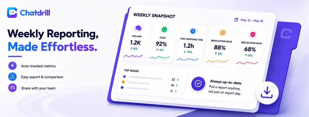
ChatDrill's dashboard surfaces the core metrics this template calls for automatically, and its export options make it straightforward to build a consistent, easy-to-distribute weekly report.
Automatic tracking of core metrics
ChatDrill tracks volume, CSAT, first response time, resolution rate, and deflection rate as standard, always-available metrics, removing the manual data-gathering that would otherwise consume much of the reporting effort.
This automation means the weekly reporting habit itself becomes considerably easier to sustain, since the core data is already there waiting rather than requiring separate compilation each week.
Exporting and sharing report data easily
Pulling a week-over-week comparison directly from ChatDrill's reporting interface simplifies building the consistent, comparable weekly snapshot this template relies on.
This ease of access also makes it more feasible to actually distribute the report broadly, since generating it doesn't require significant separate effort each week.
Because the underlying data updates continuously, the report can also be generated at any point in the week for an ad hoc check, not just on the scheduled reporting day.
Adapting the Template for Different Audiences

The core weekly report works well internally for the support team itself, but a version shared with broader leadership or other departments benefits from slightly different framing and emphasis.
The internal, operational version
For the support team's own use, the report can stay close to raw operational detail, specific queue performance, individual metric movements, since the audience already has full context for interpreting them.
This version prioritizes actionability for the team's own immediate decisions over broader narrative framing.
The leadership or cross-team version
A version shared with leadership or other departments benefits from a brief interpretive note alongside the numbers, explaining what a given trend means and whether it's expected or a genuine cause for attention.
This framing respects that a non-support audience may not have the same context to interpret a raw metric shift the same way the support team would immediately understand it.
Building a Habit Around the Reporting Cadence
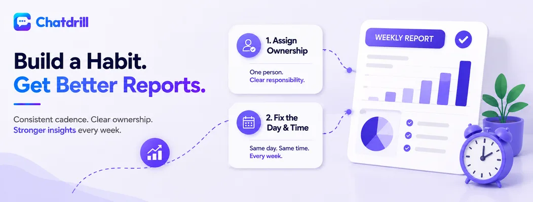
A reporting template only delivers value if the habit of actually producing and reviewing it consistently sticks, which benefits from a predictable schedule and clear ownership.
Assigning clear ownership
Designating one specific person responsible for producing the report each week, rather than leaving it as a loosely shared responsibility, prevents the reporting habit from quietly lapsing when everyone assumes someone else will handle it.
This ownership can rotate over time, but should always be clearly assigned for any given week rather than ambiguous.
Fixing the day and time
Producing and distributing the report at the same time each week, rather than whenever convenient, builds a predictable rhythm that both the producer and the readers come to expect and rely on.
This consistency also makes week-over-week comparisons genuinely apples-to-apples, since each report covers the same relative period.